Android 官方在三月的某一天更新了一个新的设计规范,所谓设计规范就是告诉开发者和设计师要如何去设计和使用某一个组件。不过这次 Bottom navigation 的发布,让许多人大跌眼镜,毕竟 Bottom navigation 这样的组件,在之前的 MD 设计语言中可是只字未提,Android 开发者与 iOS 开发中最大的不同也是由于 Bottom navigation 是 iOS 应用的必备,而遵循 MD 设计规范的 Android 应用,则对 Bottom navigation 敬而远之。
本文是 Android Bottom navigation 的第二篇文章,主要介绍样式、行为与规格。
1. 样式-Style
1.1 图标和文字-Icons and text
Because bottom navigation actions are presented as icons, they should be used for content that can be suitably communicated with icons.
由于底部导航操作显示为图标,它应该使用与其内容相符合的图标。根据以下条件来为每个操作设定样式:
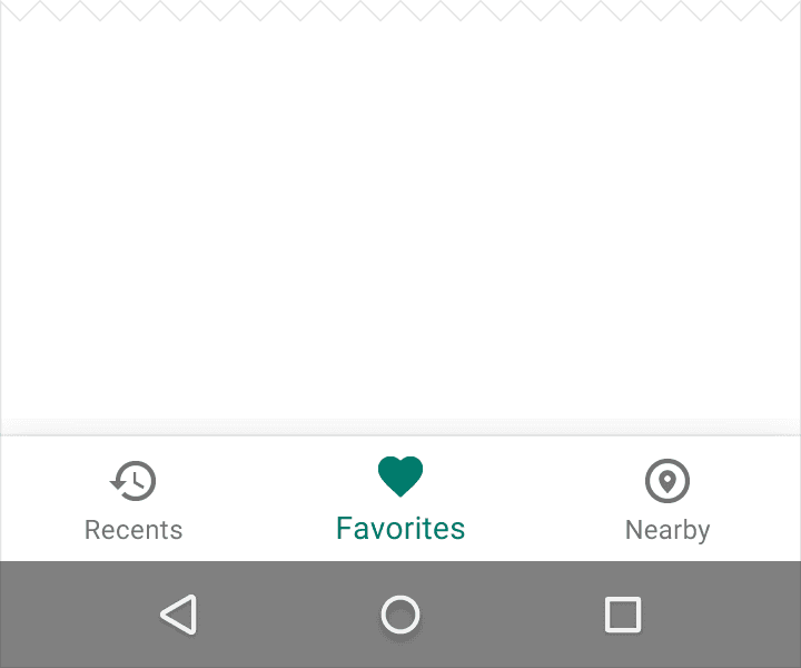
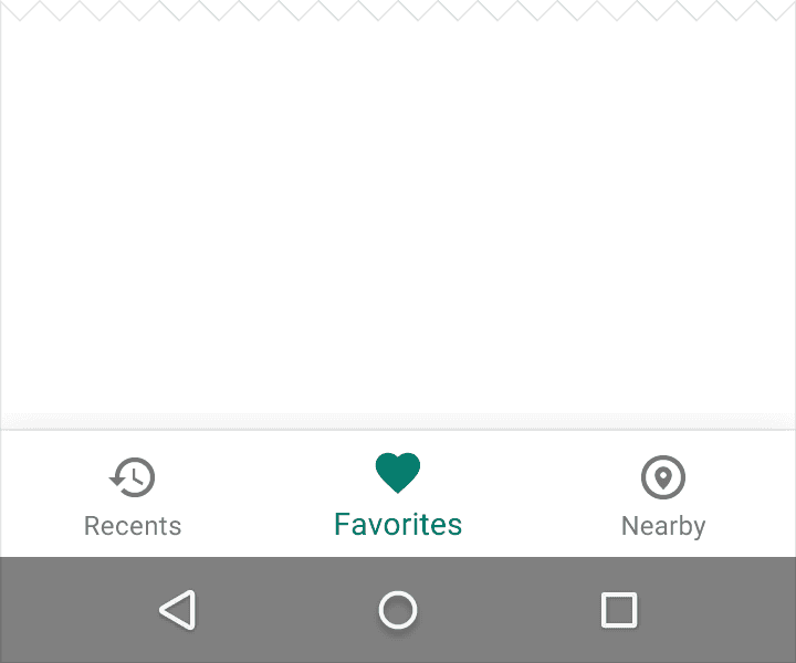
- 当 Item 是 focus 状态的时候,显示这个 Item View 的图标和文字。
- 当 bottom navigation 只有三个 Item 的时候,他们的图标和文字都应该被显示。
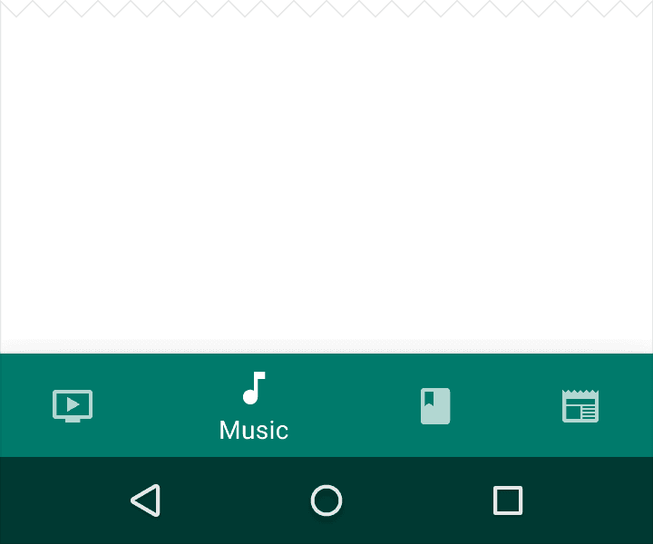
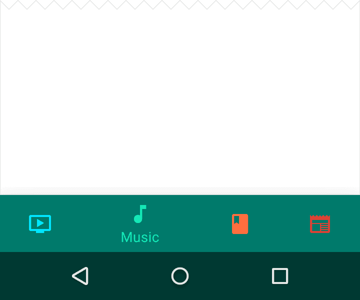
- 当 bottom navigation 有四个或者五个 Item 的时候,在非激活状态的时候只显示他们的图标即可。
1.2颜色
Tint the current bottom navigation action (including the icon and any text label present) with the app’s primary color
用应用的主色调给底部导航操作(包括图标与当前标签文字)上色。
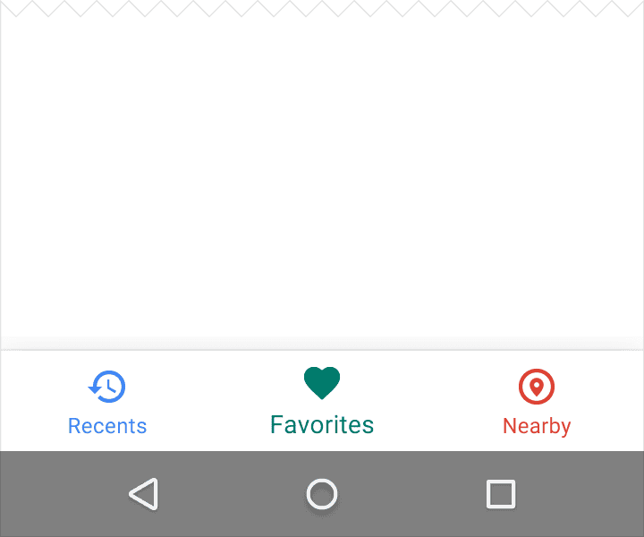
如果底部导航条已着色,将底部导航操作图标和文字设置为白色或黑色。
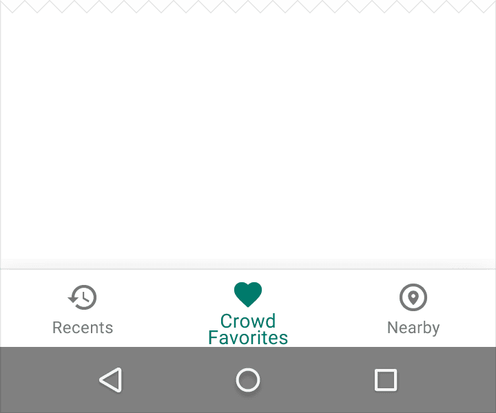
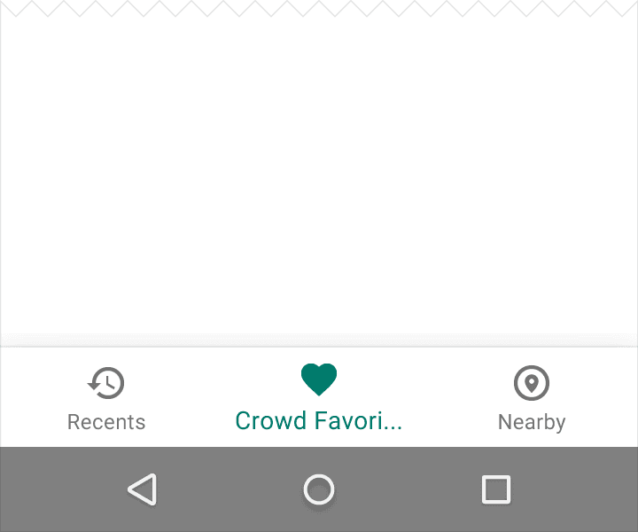
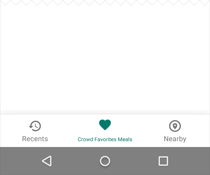
1.3文本标签
文本标签为导航图标提供简明的定义。应避免使用较长的文本而造成文本被裁截或遮挡。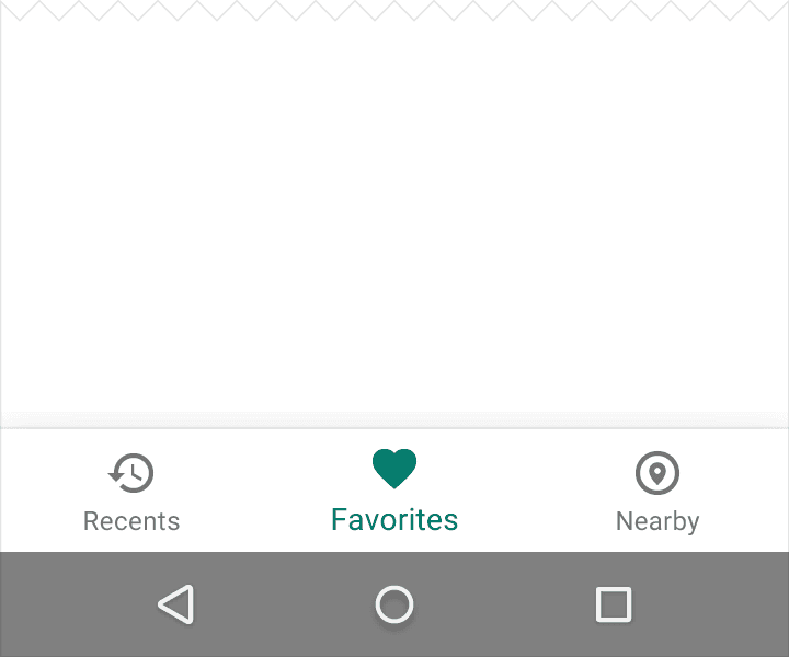
2.操作
点击底部导航图标将直接跳转至相关的界面或刷新当前的界面。
每一个底部导航图标都必须指向一个目的,不应打开主菜单或跳转至其他窗口。
每一个底部导航图标都会随着界面的滚动而动态的显示或隐藏。
- 界面向下滚动时隐藏底部导航栏
- 界面向上滚动时显示底部导航栏
在内容区域使用滑动手势不能进行界面的跳转。
在当前界面与未激活界面的跳转过程中使用淡入淡出的动画效果。
3.空间
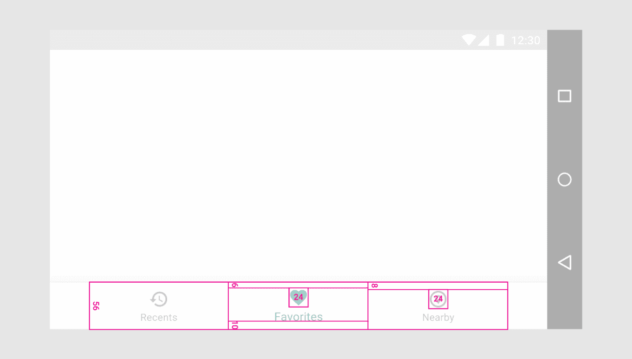
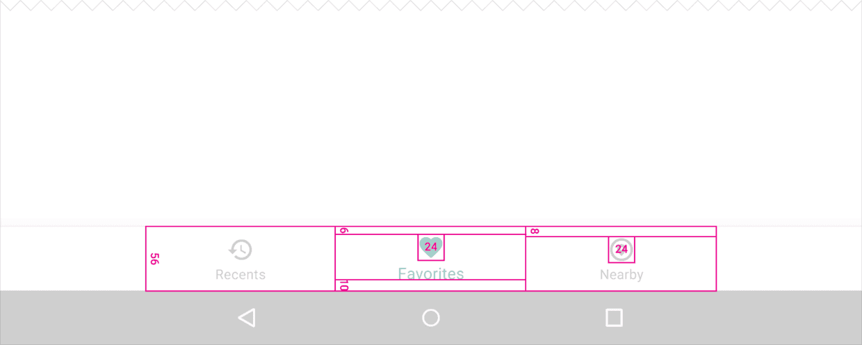
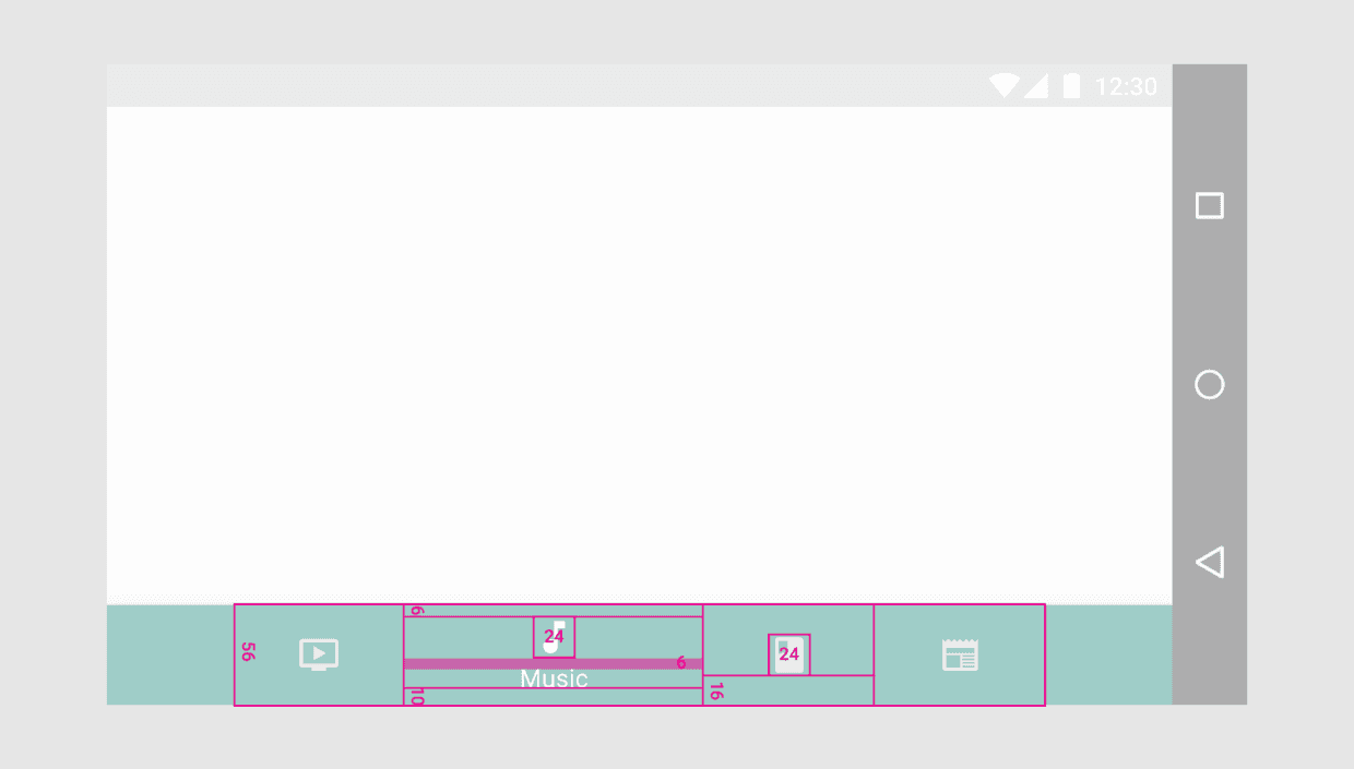
3.1确定底部导航栏
用底部导航栏的总长度除以图标的个数,计算出每个图标的宽度。也就是说,要使得每个底部导航图标占有最充足的空间。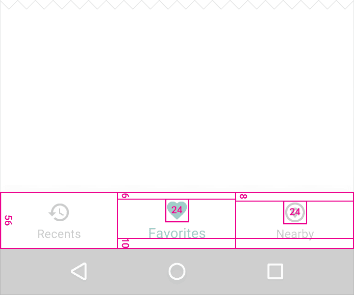
宽度的最大及最小值(这些数据包含边距):
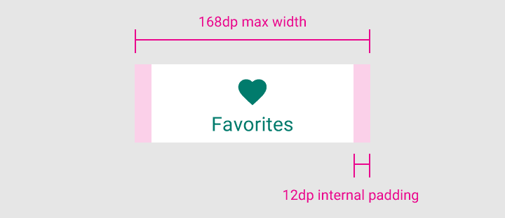
- 最大值:168dp
- 最小值:较大界面为 120dp,较小界面为 104dp
高度:
56dp
图标:
24*24dp
内容对齐:
文本与图标需居中且水平。
边距:
- 距图标 6dp(当前界面),距图标 8dp(未被激活界面)
- 距文本 10dp
- 距文本左右各 12dp
文本标签:
- 常规 Roboto字体: 14sp(当前界面)
- 常规 Roboto字体:12sp(未激活界面)
3.2切换底部导航栏
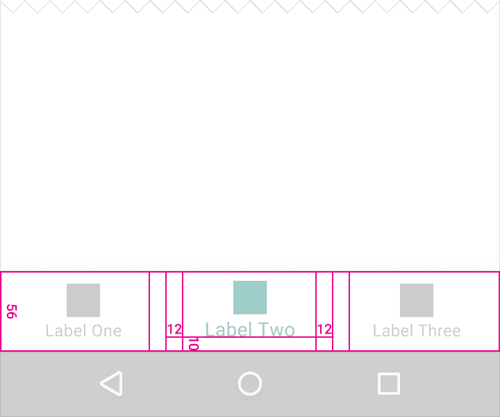
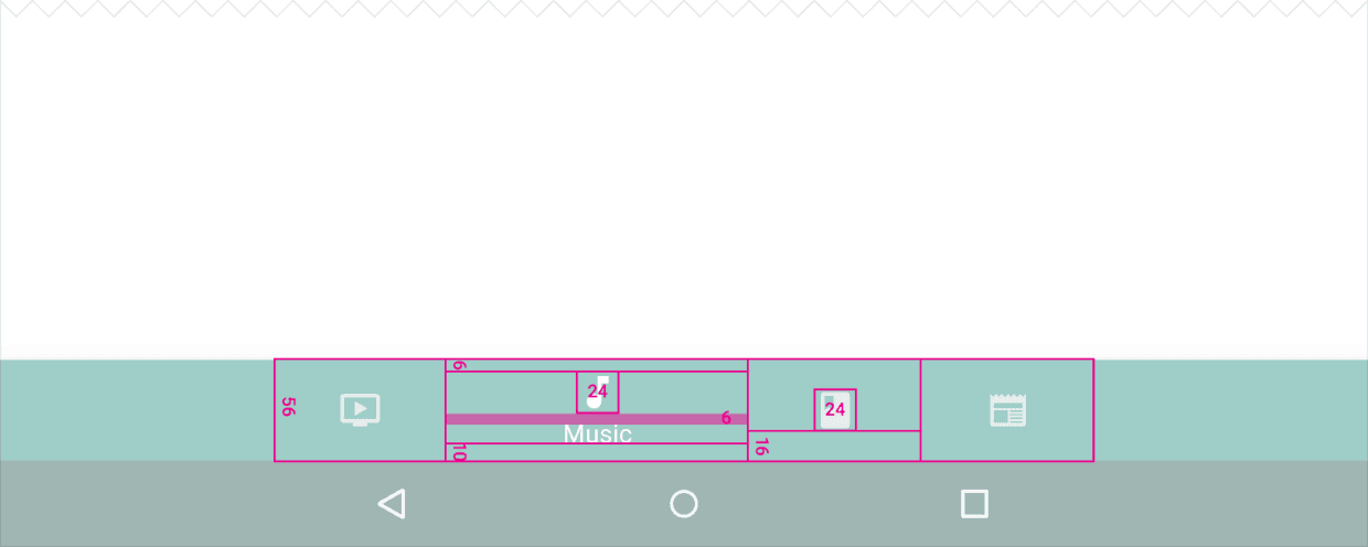
用底部导航栏的总长度除以图标的个数,计算出每个图标的宽度。
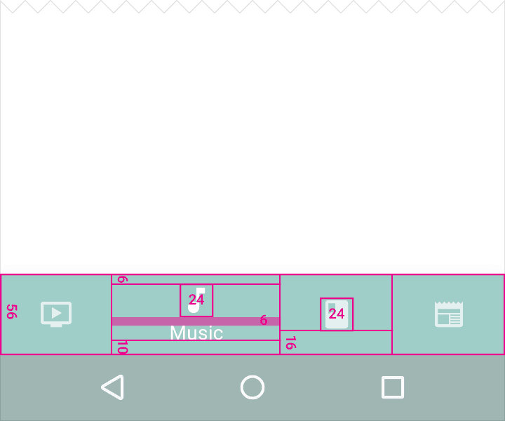
宽度的最大及最小值(这些数据包含边距):
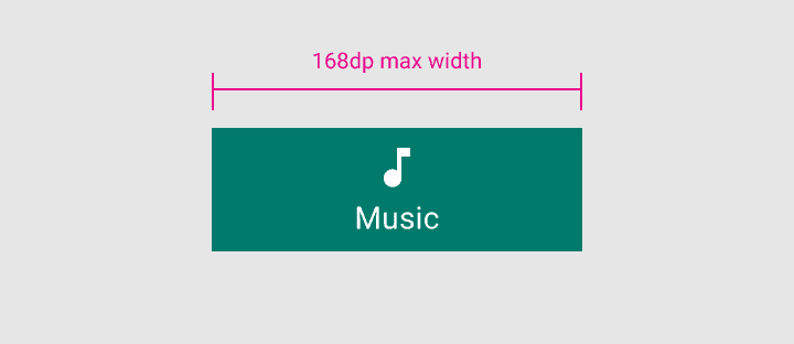
当前界面
- 最大值:168 dp
- 最小值:96 dp
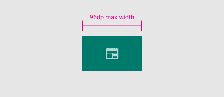
未激活界面
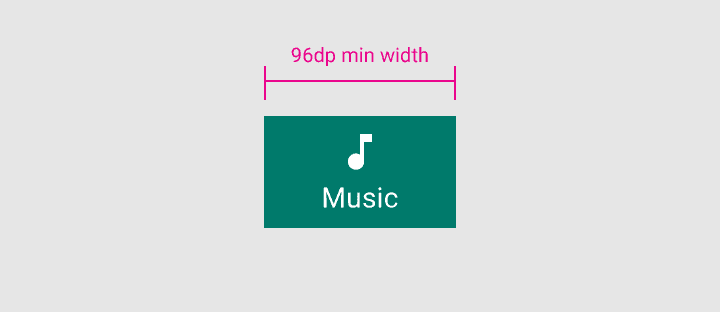
- 最大值:96 dp
- 最小值:64 dp

高度:
56dp
图标:
24*24 dp
内容对齐:
文本与图标需居中且水平。
边距:
- 距图标上 6dp(当前界面),距图标上下各 16dp(未被激活界面)
- 距文本下 10dp
文本标签:
常规 Roboto 字体: 14sp(当前界面)
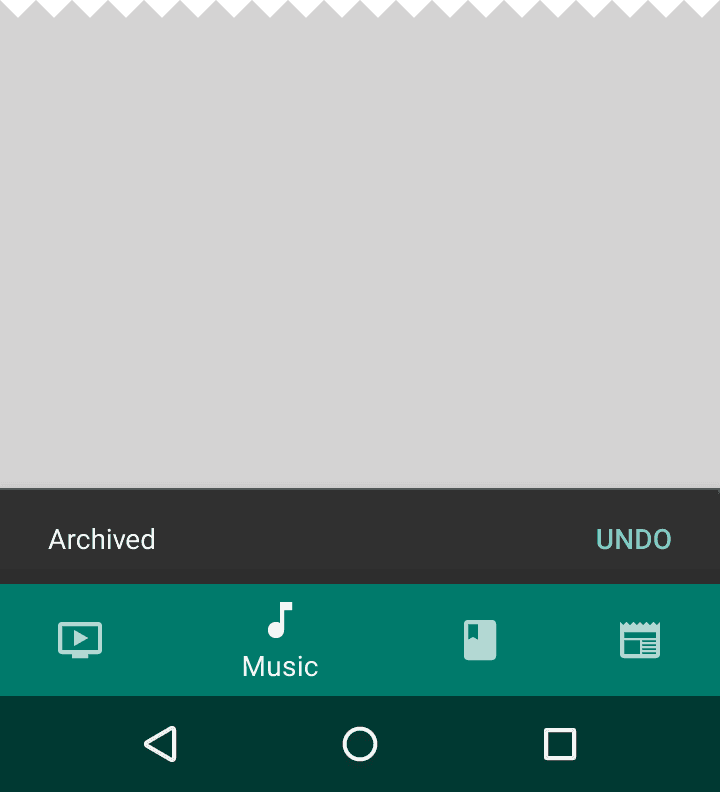
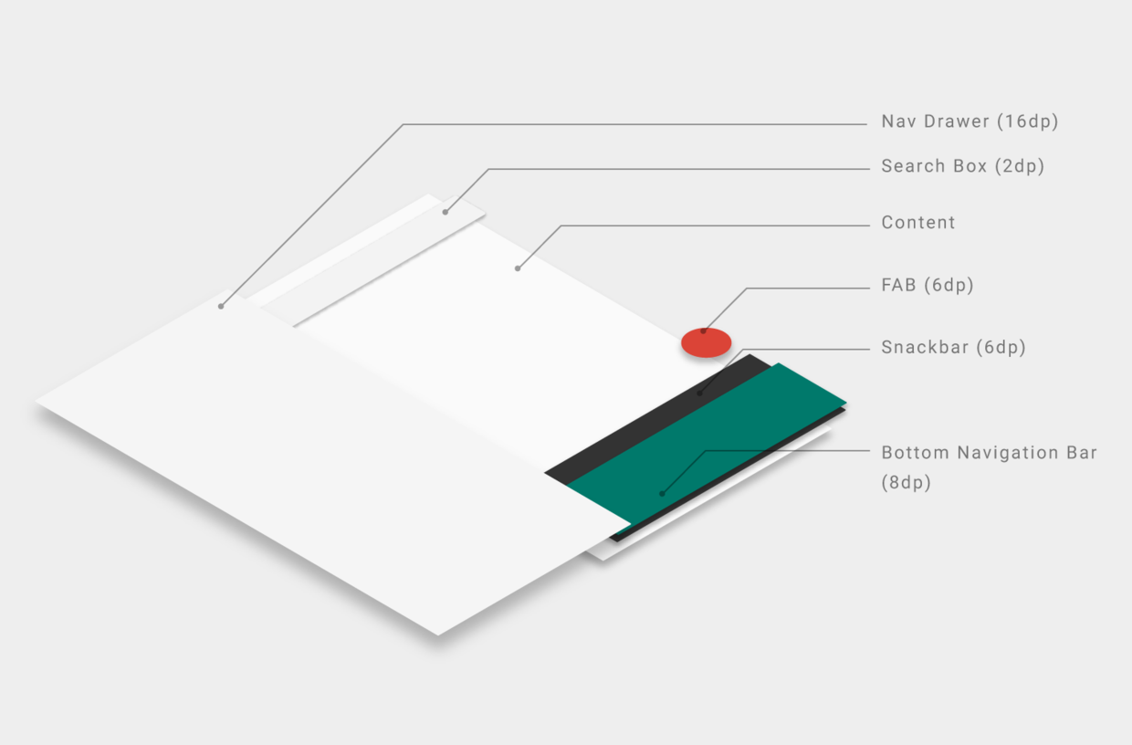
4. 层级
由于 snackbars 的层级高度(elevation) 为6dp,而 navigation bar 的层级高度为 8dp,所以 snackbars 显示在 navigation bar 的后面。而 Bottom sheets, navigation drawers 和 keyboards 都显示在 navigation bar 的前面,完全覆盖 navigation bar 。
关于我 && 博客
- 关于我 , 非常希望和大家一起交流 , 共同进步 .
- 博客内容导航
- 优秀博客文章记录 - Android 性能优化必知必会
一个人可以走的更快 , 一群人可以走的更远